Case study · Y-Needs
A home-products store, rebuilt to sell.
This online store design case study shows how Floux rebuilt Y-Needs, an Arabic WooCommerce store in Egypt for smart kitchen, bathroom and home products, on WordPress and Divi 5. Same brand colours, a clearer message, and a homepage that guides shoppers from need to cart.
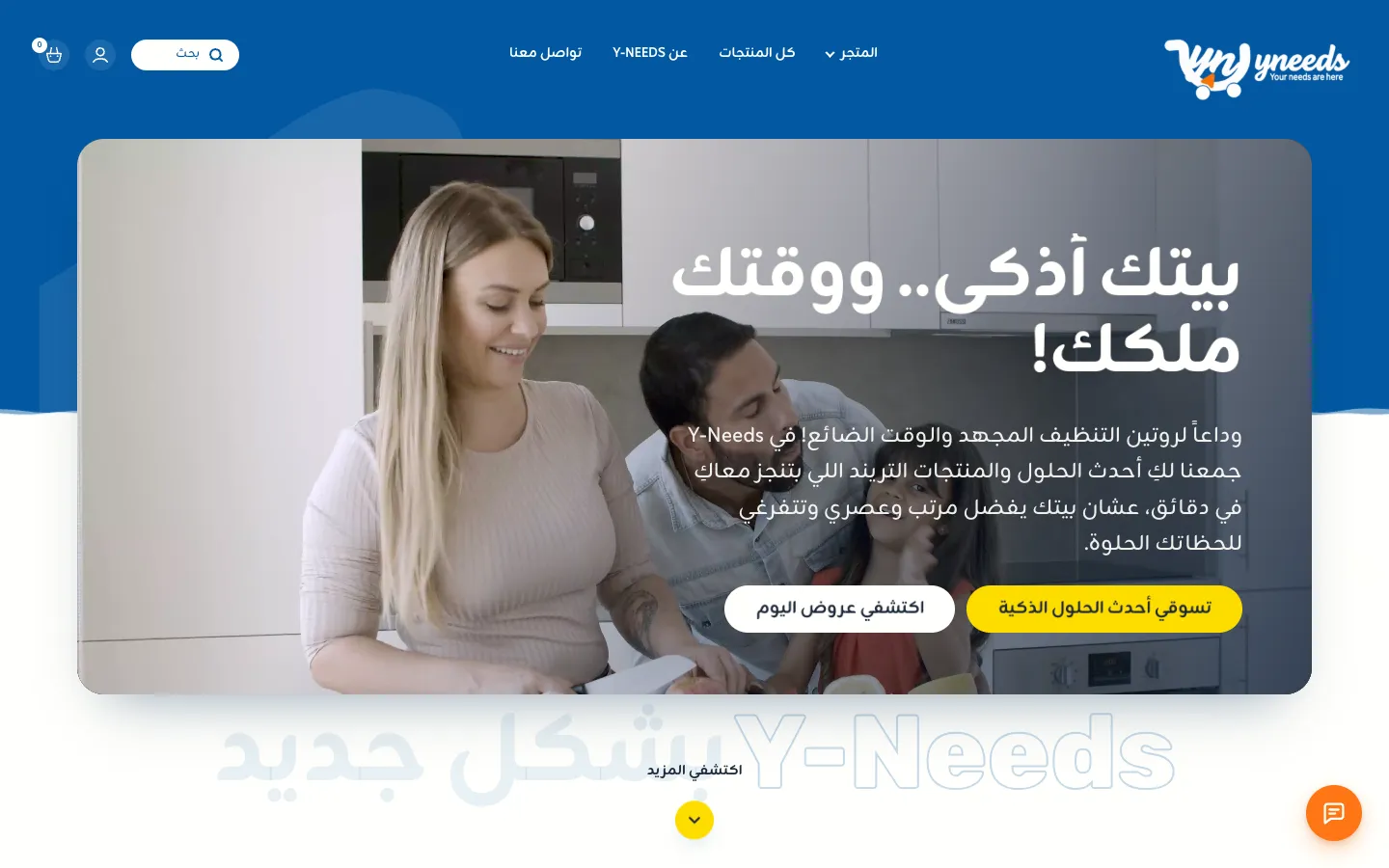
The starting point
A good shop with a weak first screen.
Y-Needs already had products people love and a recognisable blue-and-yellow brand. The old homepage did not do it justice: a generic promise, long product lists and very little reason to trust a new shop.
Our brief was simple: keep the brand, sharpen the message, and make the homepage do the selling on a phone. That brief shaped every decision in this online store design case study.
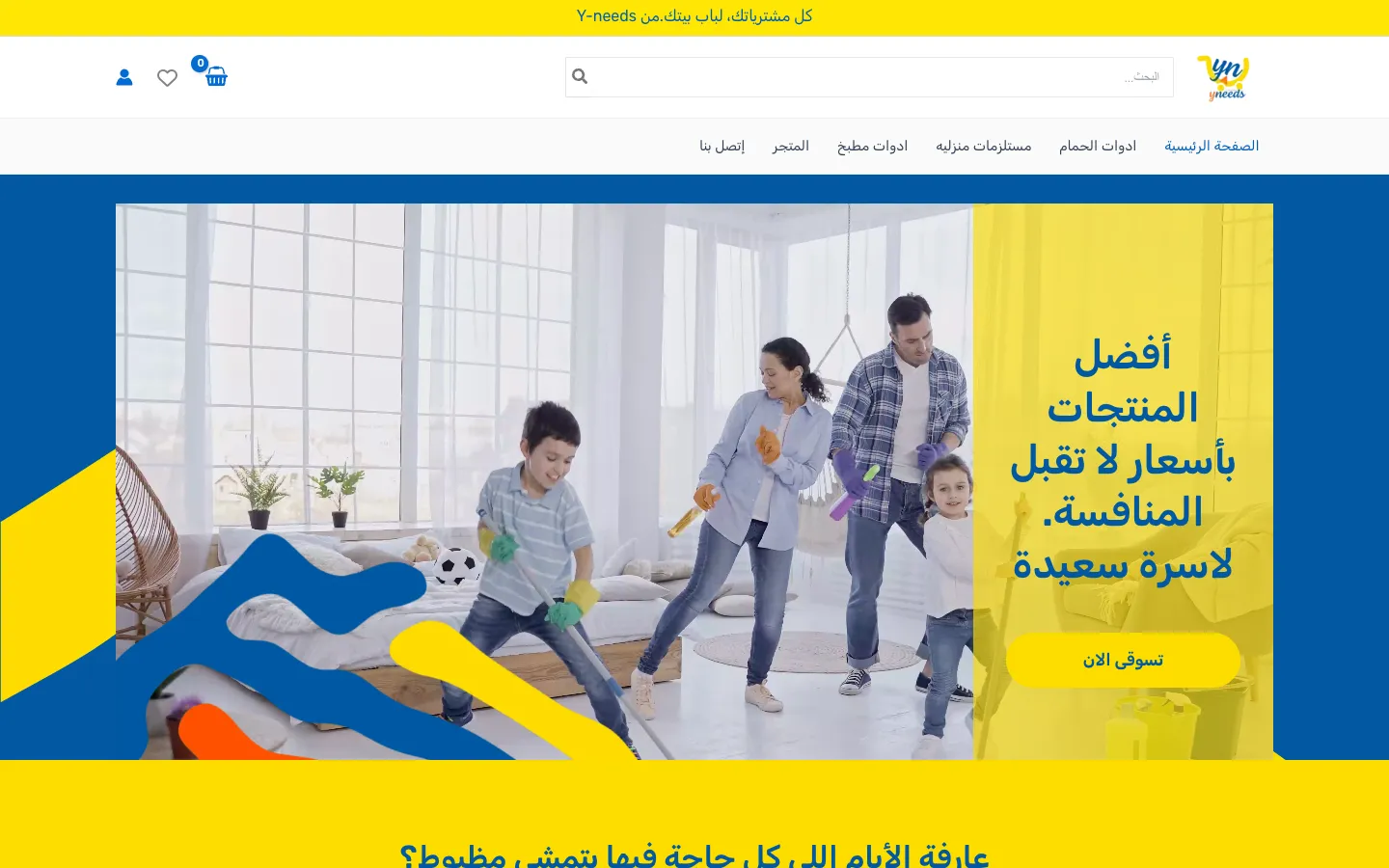
- A generic headline (best products, unbeatable prices) that could belong to any shop
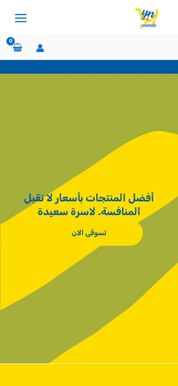
- On phones the first screen was an empty yellow banner, with no photo and no clear offer
- Products shown as long paginated lists instead of by need, best sellers or deals
- Shipping and returns were only footer links; delivery times and cash on delivery were not mentioned
Before and after
Same brand. A different first impression.
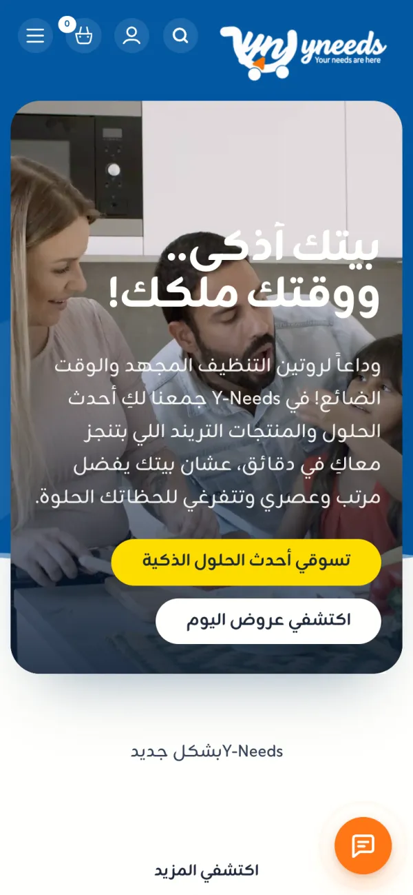
The heart of any online store design case study is the first screen a shopper sees. Here it is on desktop and on a phone: the old y-needs.shop and the new store.
Before
After
Before
After
The new homepage
From first screen to footer, scroll it.
Departments, best sellers, deals, the brand story, reviews, home tips and the newsletter offer, in the order a shopper needs them.

Results
What the owner gets today.
We publish numbers only when they are measured on the live store over time, and this online store design case study will be updated when they are. Until then, here is what changed on day one.
- A first screen that explains the shop and shows an offer on every device
- Products grouped the way people shop: by room, by best seller and by deal
- Every trust question (delivery, payment, returns) answered before the first scroll ends
- A store the owner fully controls: their WordPress, their WooCommerce, their content
- SEO foundations in place with Rank Math, clean Arabic URLs and a content section to grow
FAQ
Questions about this project.
What store owners ask us after seeing the Y-Needs redesign.
What did Floux change in this online store design case study?
We kept the Y-Needs brand colours and logo, then rebuilt the homepage around the shopper: a clear hero message for newly-weds and busy mums, four shop-by-need departments, best sellers and daily deals, delivery, cash on delivery and returns shown up front, a home-tips blog and a newsletter offer.
Which platform is the Y-Needs store built on?
Y-Needs runs on WordPress with WooCommerce for products, cart and checkout, and Divi 5 for the design. Rank Math handles SEO, and a small custom plugin adds the store features the owner needed. The owner has full access to everything.
Can you redesign my existing WooCommerce store the same way?
Yes. A WooCommerce store redesign starts with a review of your current store: we keep what already works (products, orders, customers and brand) and redesign the pages that sell, as in this online store design case study. Your store stays live while we build the new design on a private staging copy.
Is the Y-Needs store in Arabic?
Yes. The store is fully Arabic and right-to-left, written in friendly Egyptian Arabic for shoppers across Egypt. We build bilingual Arabic and English stores too when a brand sells to both audiences.
Websites that flow. Designed in Arabic and English, built on WordPress and WooCommerce, owned by you.