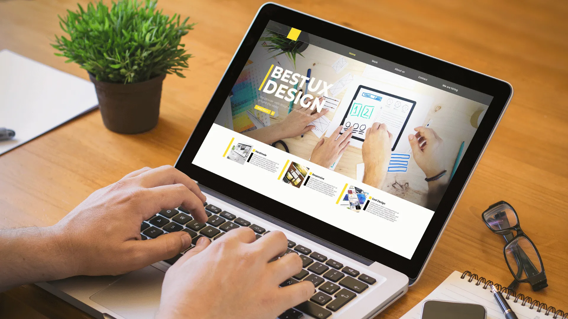
A first-time visitor gives your website a few seconds before deciding to stay or go back to Google. In that time they are not reading, they are scanning. They judge the whole business on a handful of signals. Here is the 7-second website test we use when we review a client's website, and how to pass it. Usability research from the Nielsen Norman Group shows most visitors leave within the first 10–20 seconds unless the page gives them a reason to stay.
Key takeaways
- Visitors scan before they read: headline, visuals, layout and the main button carry the first impression.
- Clarity beats cleverness. Say what you do, for whom, and what to do next.
- Test on a phone first, because that is where most first impressions now happen.
Table of contents

Second 1: Does the page load and look finished?
A blank screen, a jumping layout or a half-loaded slider says "unreliable" before any content appears. The first screen should appear quickly and stay stable while the rest loads. Optimised images, lean code and good hosting do most of the work.
Second 2: Can I tell what this business does?
The headline must name the offer in plain words. "Websites that turn visitors into customers" works because it states the service and the benefit. A vague slogan forces visitors to scroll to find out, and many will not.
Second 3: Is this for someone like me?
People look for signals that the business serves them: their location, their industry, their language. A clinic in Cairo, a store that ships to the Gulf, a site in Arabic and English. If your audience is specific, say so near the top.
Second 4: Does it look trustworthy?
Visitors judge trust visually before they read a single review. Consistent colours and typography, real photography, enough white space and a clean layout all signal a professional business. Outdated design, stretched images and clashing fonts signal the opposite, even if your service is excellent.
Second 5: Is it easy to scan?
Large blocks of text get skipped. Short headings, short paragraphs, bullet points and clear sections let visitors find what they need. Each section should have one job and a heading that tells the reader what that job is.
Second 6: Where do I click next?
There should be one obvious main action on the first screen, and it should look like a button. Secondary options such as "See our work" can sit beside it, but they should be visually quieter. If visitors have to hunt for the next step, they leave.
Second 7: Does it work on my phone?
Pinching to zoom, tiny tap targets and menus that cover the screen are instant exits on mobile. Design the mobile version deliberately rather than shrinking the desktop version. Buttons need space around them, text needs to be readable without zooming, and the phone number should be one tap away.
How to run the 7-second website test on your own site
- Ask someone who does not know your business to open your homepage on their phone.
- After seven seconds, take the phone away.
- Ask: What does this business do? Who is it for? What would you click next?
If they cannot answer all three, the first screen needs work. Repeat the test on your most important service pages, not just the homepage, because many visitors land there first from Google.
What a strong first screen includes
- A clear headline that names the service and the benefit
- One supporting sentence that adds specifics
- A primary button and, optionally, one secondary link
- A real image that shows the product, the place or the people
- A quick trust signal, such as a short list of what is included or a rating
This is the structure that passes the 7-second website test, and the one we use on every Floux build, from WordPress websites to online stores, because it consistently helps visitors understand and act faster.
A clear first impression starts with a consistent brand. See how our branding and visual identity work and conversion rate optimization help visitors trust you in seconds.
Frequently asked questions
Is the 7-second website test scientific?
It is a practical rule of thumb rather than a precise measurement. First impressions of websites form very quickly, which is why the first screen deserves more attention than any other part of the page.
Should my homepage have a slider?
Usually not. Sliders hide most of their content, slow the page and split attention between several messages. One strong message and image almost always performs better.
Does the 7-second test apply to landing pages?
Even more so. Visitors from ads are impatient and compare you with competitors in other tabs. A focused landing page with one offer and one action is built to pass it.